Dashboard view
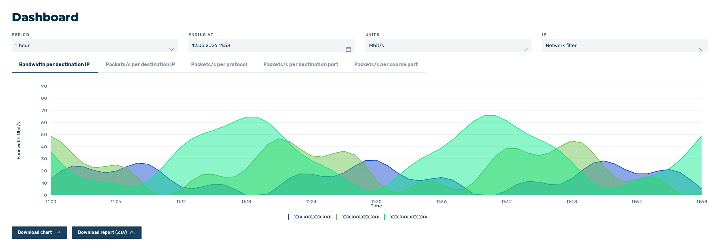
Dashboard view
The Dashboard view of the respective company provides you with access to various traffic diagrams that give you information about the company's networks.
The following diagrams are available in the Dashboard view:
| Name | Definition |
|---|---|
| Bandwidth per destination IP | This diagram shows the bandwidth per second for the available destination IPs. |
| Packets/s per destination IP | This diagram shows how many packets per second were sent to the respective destination IPs. |
| Packets/s per protocol | This diagram shows the number of packets received per second, grouped by transmission protocol. The legend below the diagram shows the names of the protocols recorded, for example, ICMP, TCP, UDP. |
| Packets/s per destination port | This diagram shows the number of packets received per second for the destination port. The numbers of the ports recorded can be found in the legend below the diagrams. |
| Packets/s per source port | This diagram shows the number of packets received per second for the source port. The numbers of the ports recorded can be found in the legend below the diagrams. |
| Legend filter | In addition to the filters above the diagrams, there are diagram-specific filters that can be set using the values in the legend. The following filters are available:
|

Filters in the Dashboard
You can use filters to define the data shown:
| Name | Definition |
|---|---|
| Period | shows the data per second for the selected time intervals:
|
| Ending at | Defines the time period during which the data should be shown according to the time interval defined at PERIOD. To change the date, select a date and time using the icon  .ExampleFor example, if you select 1 hour as the time period and 01.08.2024 12:00 as the end time, the data for the period from 11:00 a.m. on 01.08.2024 to 12:00 p.m. on 01.08.2024 will be shown. .ExampleFor example, if you select 1 hour as the time period and 01.08.2024 12:00 as the end time, the data for the period from 11:00 a.m. on 01.08.2024 to 12:00 p.m. on 01.08.2024 will be shown. |
| Units | For the Bandwidth per destination IP diagram, you can choose between the units Gbit/s, Mbit/s, Kbit/s, and bit/s. All other charts use the unit packets/s, which cannot be changed. |
| IP | Allows you to show data for specific IP addresses or entire networks using the following values:
|
You can zoom in on any chart, which will enlarge the selected time period. To do this, select the desired area by holding down the left mouse button.
In addition, two buttons can be used to download the data for each diagram:
- Download chart: Downloads the chart as a PNG file.
- Download report (.csv): Downloads the data from the chart as a CSV file.